You are opening our English language website. You can keep reading or switch to other languages.

Trading Terminal Redesign

Trading Terminal Redesign

Product Description

TSA (Trading Solutions Accelerator) is an innovative trading terminal simulating the ability to trade with instruments on different markets. The platform aims to deliver a seamless user experience while offering a wide range of products and pricing transparency with an easy-to-use interface.

Problems

The current tool was suffering from several UX/UI issues, making it non-competitive in the market. While conducting an expert review following generally accepted heuristics and expert opinions, the following issues were identified:

  • Outdated product design and lack of brand development.
  • Non-customizable interface, making the tool uncomfortable to use.
  • Unintuitive widget prioritization.
  • Reduced accessibility, especially for users with vision problems.
  • Deceptive color palette.


Apart from mentioned below critical points, a large number of minor errors were found in the interface, such as the lack of a currency search, a negative account status, a pop-up blocking a part of the interface with important information, low button contrast, etc.

Challenge

The main goals were:
  • Create a representation of our UX competence in the trading field.
  • Design based on competitor's best practices and industry trends.

What We Did

UX EvaluationCompetitor ResearchInformation ArchitectureWireframing
Interactive PrototypingUI Design Library

Solution Highlights

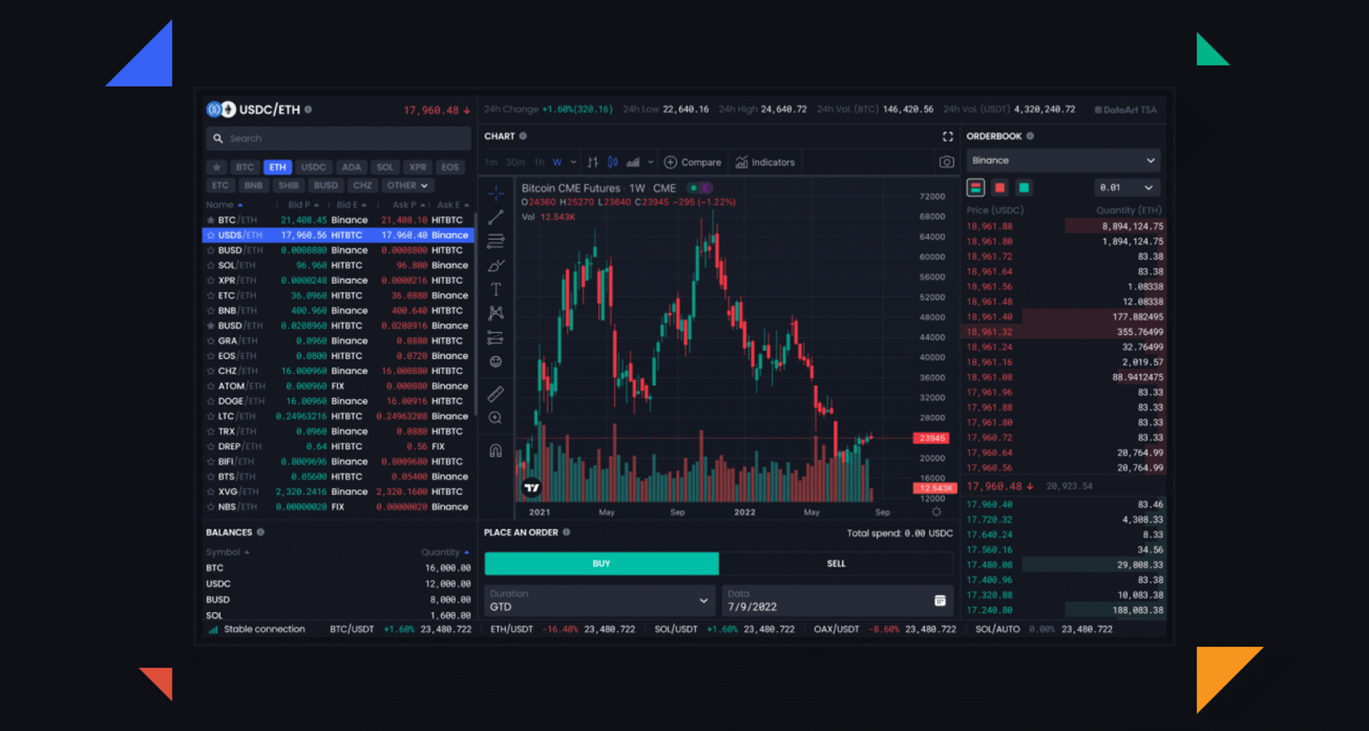
Taking this platform as a base, our UI/UX experts completely updated the interface and created a universal solution that can be applied to all trading products.
Image

Modern Look and Feel

Completely redesigned interface based on extensive competitive analysis. A dark theme with green and red colors has been selected to make the platform more appealing and professional.
Image

Intuitive Interface

The features of the platform are placed depending on the user’s needs. Sections with top priority are moved to be at the trader’s fingertip.
Image

Frictionless Navigation

The revamped site structure made the content easily digestible. We created a clear visual separation and intuitive hierarchy for the large volume of information.

Project Details

Our team redesigned the platform in a way to allow users to trade and accomplish their tasks in a few clicks while following their own strategy.
UX Evaluation

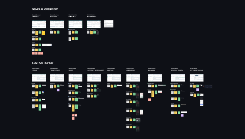
We conducted an in-depth interface analysis to identify existing issues and develop our design plan. To ensure efficient work, we performed a heuristic evaluation with an independent walkthrough and issue reporting.

We divided the whole process into general and section reviews. In the first part, we considered the operation of the interface from 4 UDC viewpoints as Visibility, Accessibility, Legibility, and Language. In the section review, we divided the interface into widgets and analyzed their work separately from each other.
UX Evaluation Example Image

Competitor Research

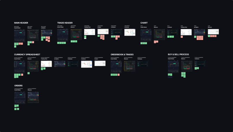
In parallel, extensive competitor analysis was conducted to better understand the market. After revealing the industry leaders, we reviewed their interfaces and prepared a detailed report describing each solution’s main advantages and disadvantages.

This phase was approached the same way as the previous one by dividing the workflow into general and segmented parts.
Competitor Research Example Image

New Visual Hierarchy of Widgets

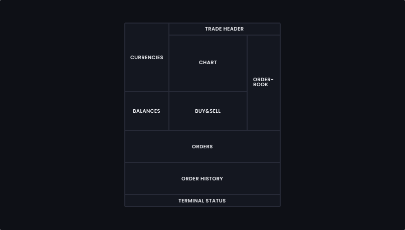
Considering the insights revealed from the discovery phase, we did a complete decomposition of the layout to create a self-explanatory and intuitive product design.

While using the notion of “Above the fold,” we placed the most important and frequently used features on the top half of the page so the users can access them without even scrolling down. Everything the traders need to see is right in front of them, contributing to a good user experience.
New Visual Hierarchy Of Widgets Example Image

Modern UI Library

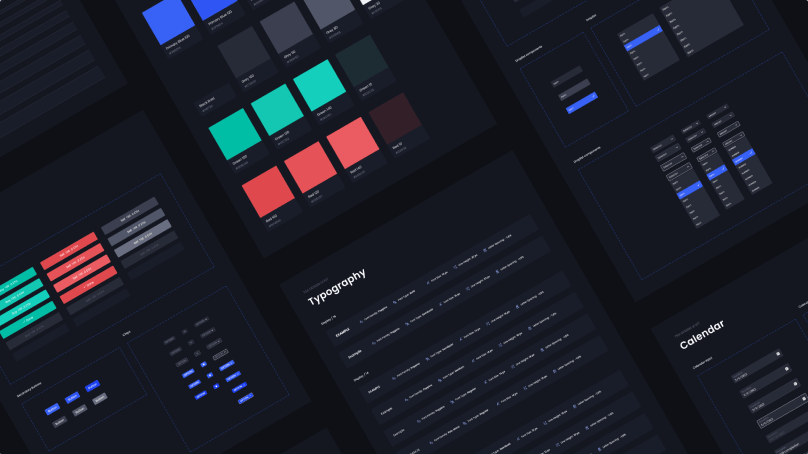
Major updates were made to create modern components that would pass the accessibility test while preserving high data density per screen. We implemented a dark UI design to highlight context boundaries and allow users to quickly monitor and interpret dynamic market conditions in a dense information environment. As the target user’s primary goal is to quickly scan for information, our dark UI can improve performance by helping them comprehend information at a glance. The negative space in a dark theme absorbs light, allowing it to recede naturally into the background while conversely emphasizing key data elements.
Modern UI Library Example Image

Additional Features

We added new features to the product to make it more convenient:

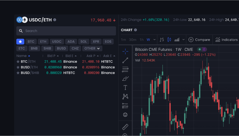
  • Favorites Section
    To immediately save the currency pair in a list to quickly access them. Design based on competitors’ best practices and industry trends.
  • Special Highlight for the Fast-Growing Currencies
    The user can immediately analyze and buy them at the point of growth.
UX Case Study Example Image

Conclusion

As a result, we redesigned the trading terminal from the ground up to match the current industry trends. The updated solution makes the trading experience more intuitive and efficient for our users.

By integrating best practices and unique UI/UX approaches, we developed a new interface that will help users stay ahead of the competition, making it easier to access the information and tools they need for informed decisions.

Outcomes

The solution complies with the best practices of the financial marketThe client can scale the product to their current and future business needsScalable solution that can be integrated with other technologies
Contact Us

Anastasia leads the dynamic DataArt Design Studio team of UI/UX specialists, 3/2D artists and webmasters and coordinating the resources, establishing the processes and working on both internal and external PR of UX services. Anastasia has a vast hand-on experience in design, which helps to be on the same page with designers and clients.

Head of Design Studio / Belgrade, Serbia
Anastasia Rezhepp
Head of Design Studio / Belgrade, Serbia